Selfwealth
Enhancing the platforms on-boarding experience
Client
Selfwealth
Agency
Bound
Research, Wireframing, UI Design
Category
Background
Selfwealth is an Australian online trading platform that provides low-cost, flat-fee brokerage services for trading on the Australian Securities Exchange (ASX) and international markets, including the United States and Hong Kong. As of November 2024, Selfwealth serves over 129,000 Australian investors and manages more than $10 billion in funds. In response to a decline in user sign-ups and increasing drop offs, they are seeking to improve their onboarding process.
The Problem
Selfwealth's trading platform is highly regarded for its user friendly interface, but the onboarding process does not align with the quality of the platform. Currently, new users must go through a two-step process managed by two separate parties to complete account creation and the KYC process. This procedure is lengthy, lacks alignment with UX best practices, has broken mobile functionality, and fails to meet accessibility standards.
My Role
As the sole designer leading the project, I partnered with a product owner and an external development team to manage the initiative. My responsibilities included project management, analysing data and the current flow, conducting competitor analysis, presenting findings to the client, mapping out optimised user flows, prototyping and testing new flows, and creating finalised artwork for both mobile and desktop platforms.
Selfwealth's on boarding process comprises two distinct steps: one hosted on their platform and the other managed by a third party. These steps feature inconsistent design styles that deviate from the current brand style guide. Accessibility concerns are evident, with multiple areas failing to meet even the A standard. Additionally, interactions for similar elements are inconsistent throughout the journey, resulting in a disjointed user experience.
The structure and phrasing of the questions have not been thoughtfully designed, with some questions unnecessarily repeated during the process. The form lacks an intelligent layout, presenting all questions at once without adapting to users' previous inputs. This lack of personalisation and consideration detracts from the overall efficiency and usability of the on boarding experience.
Current Flow

At the start of the project, a competitor analysis was carried out to identify common themes in their on boarding processes. We documented each competitor's journey, noting the questions asked and the format used. This analysis highlighted several areas where Selfwealth's approach diverged from market trends, leading to a sign-up process that was nearly twice as long as some of its competitors.
Competitor Analysis


Once we analysed the current analytics data and combined it with competitor insights, we began to shape a vision for how the new flow might function. This process involved numerous iterations, enabling us to refine the flow continually. During this refinement, we focused on identifying which questions could be eliminated or deemed unnecessary during this process.
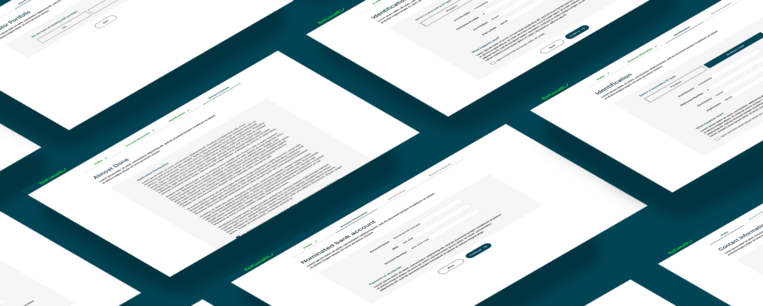
When finalised, we successfully reduced the on boarding flow to 28 questions/inputs, depending on the user's selections. This marks a reduction of 20 questions from the original form, representing a 41% decrease in inputs.
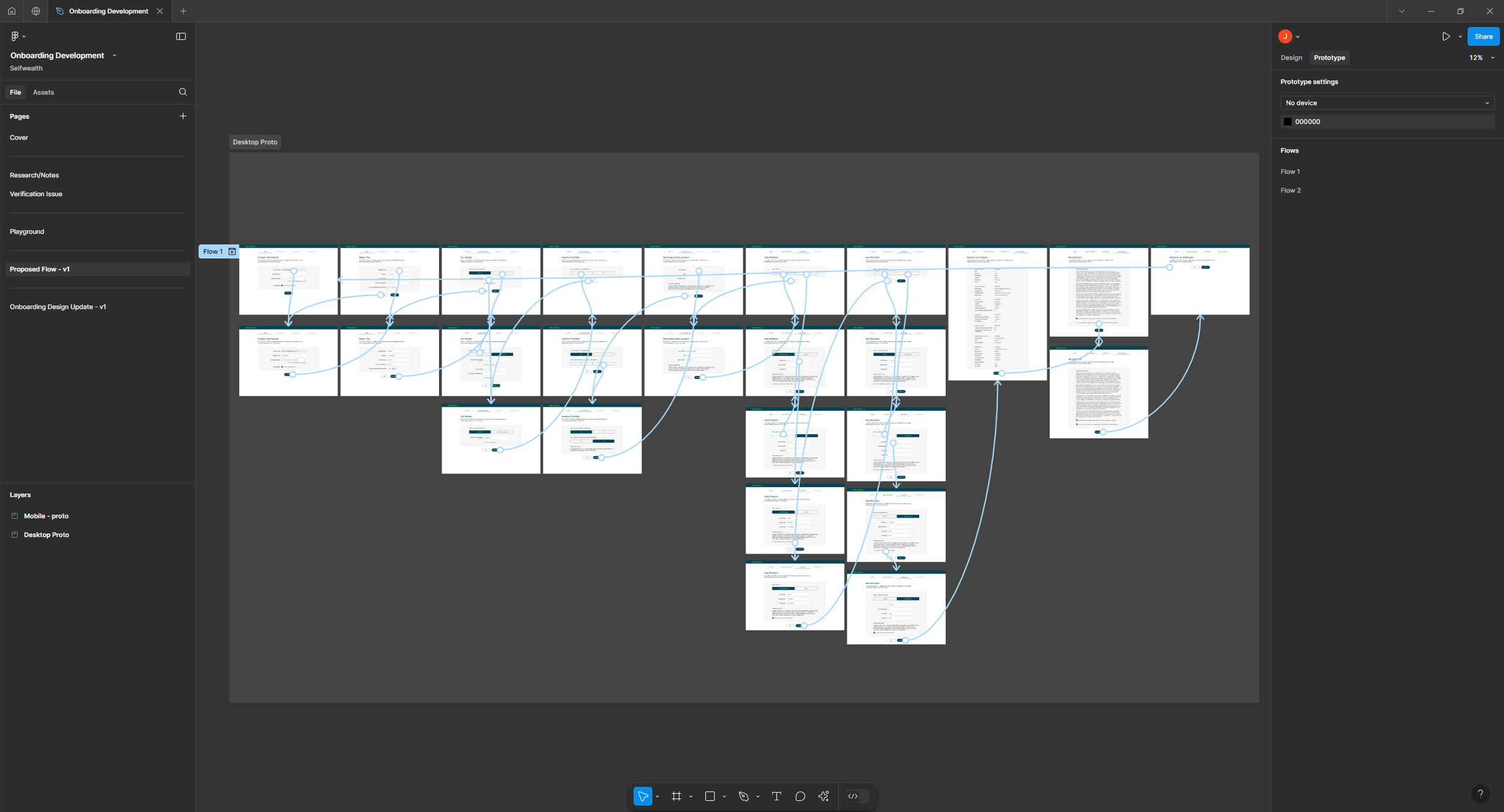
Mapping Improved Flow


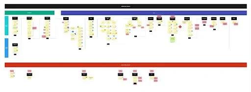


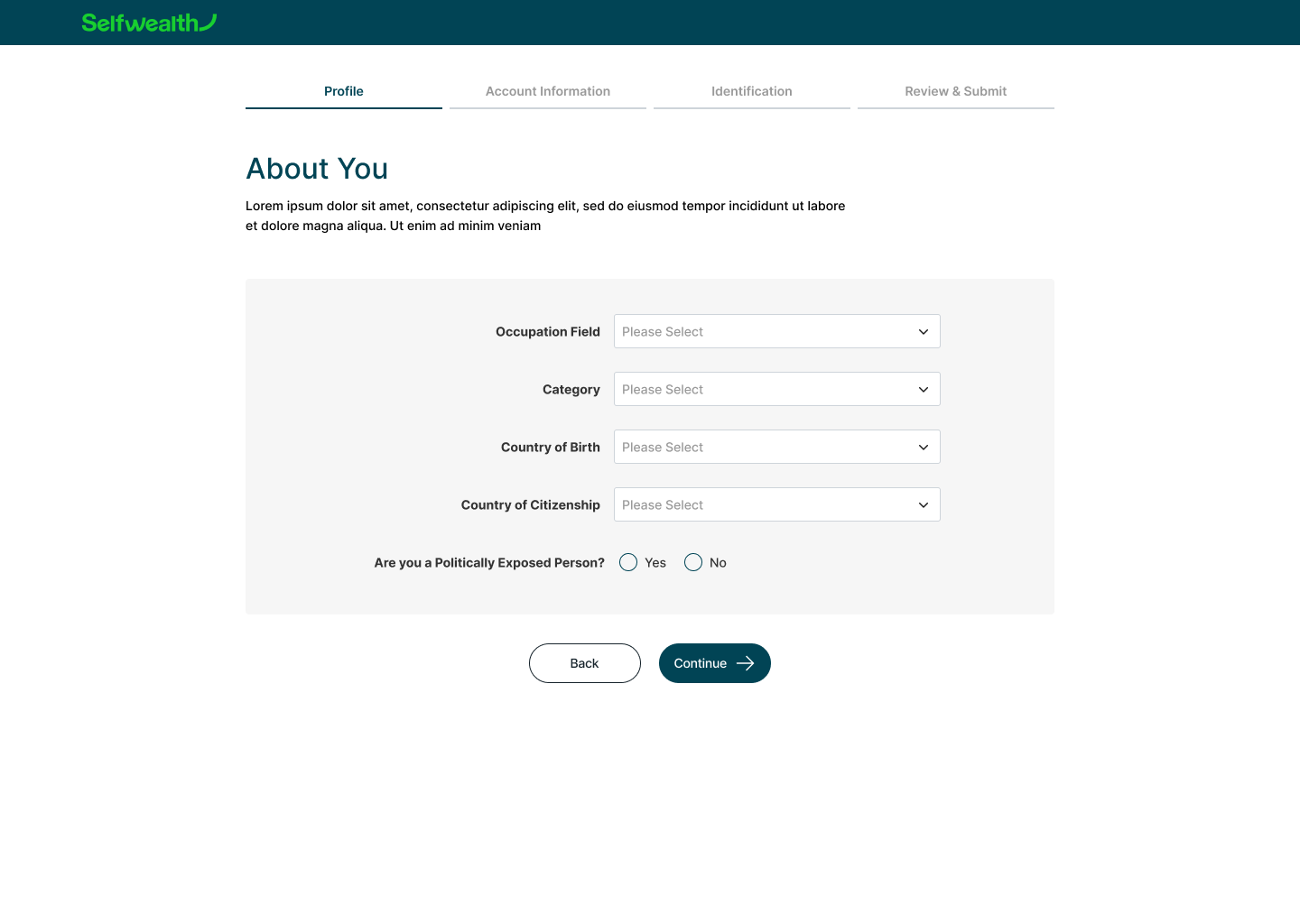

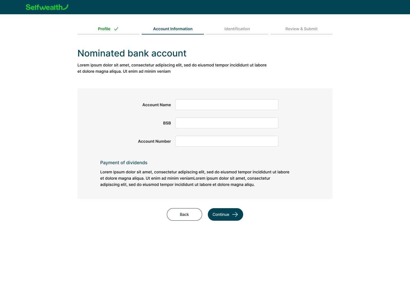
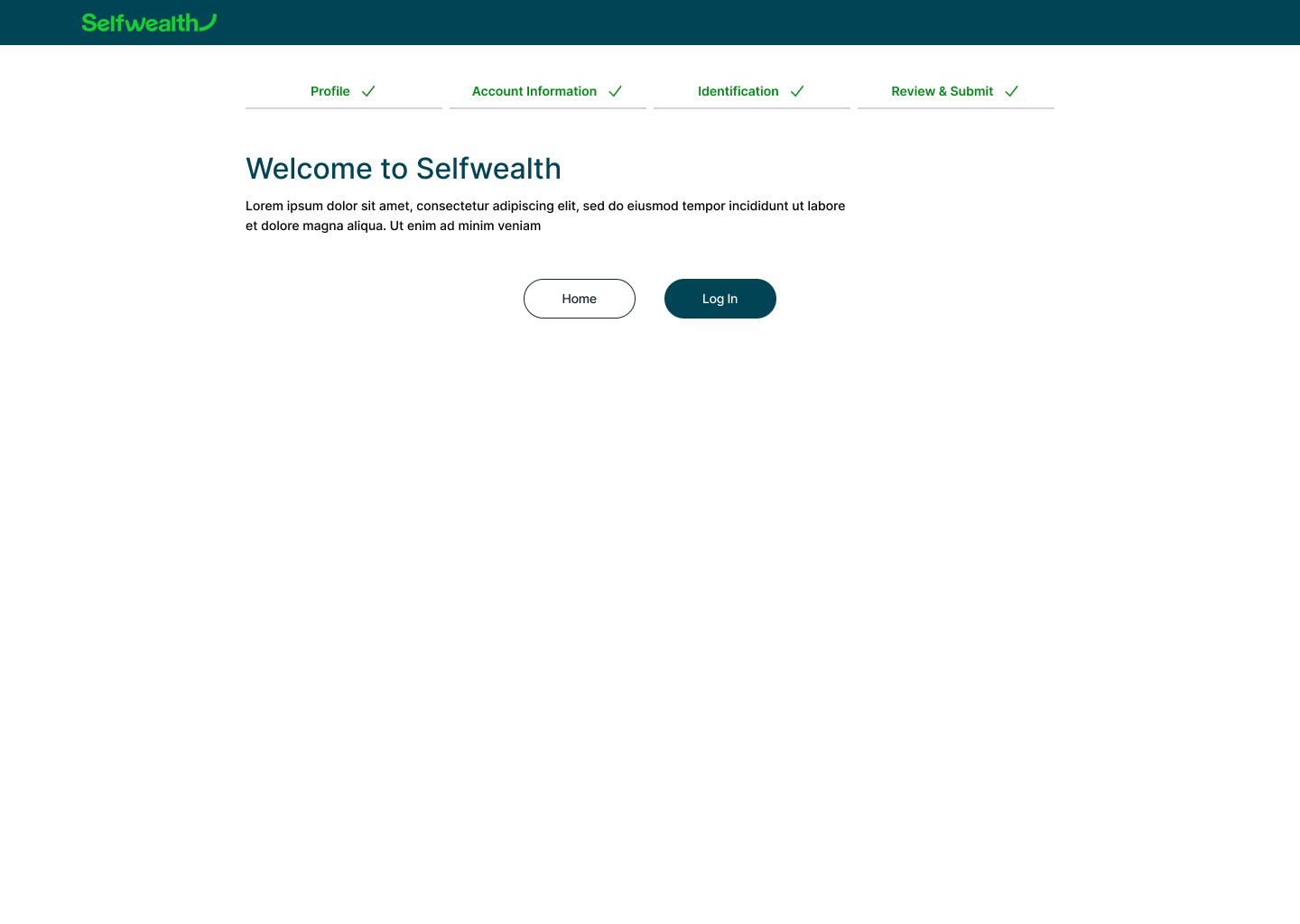
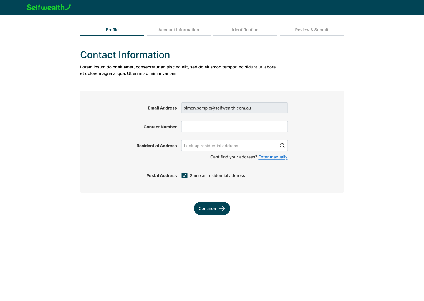
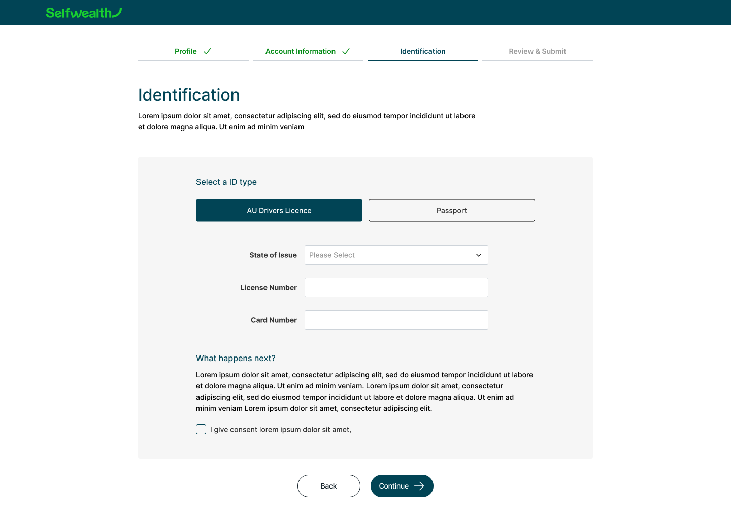

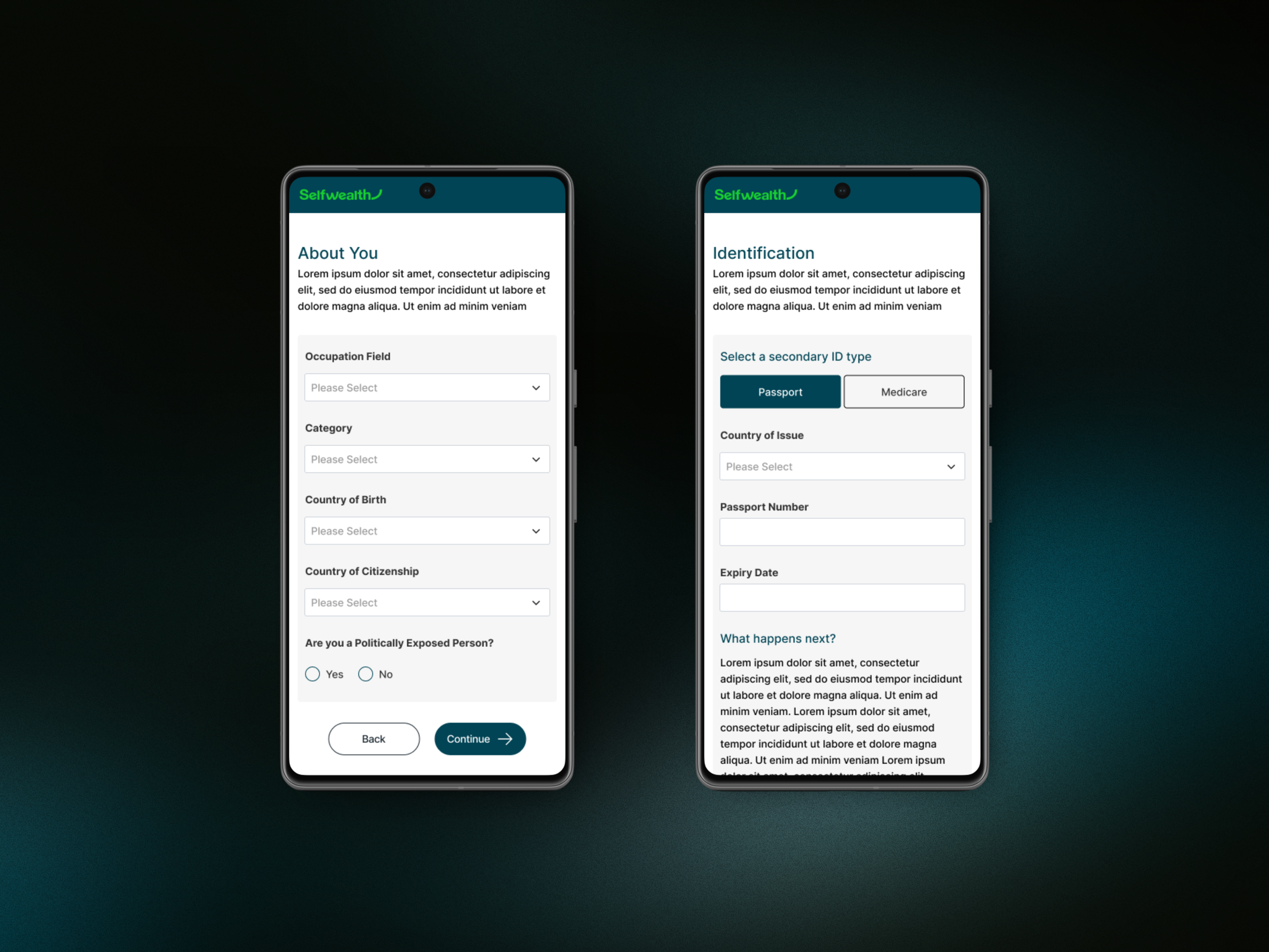
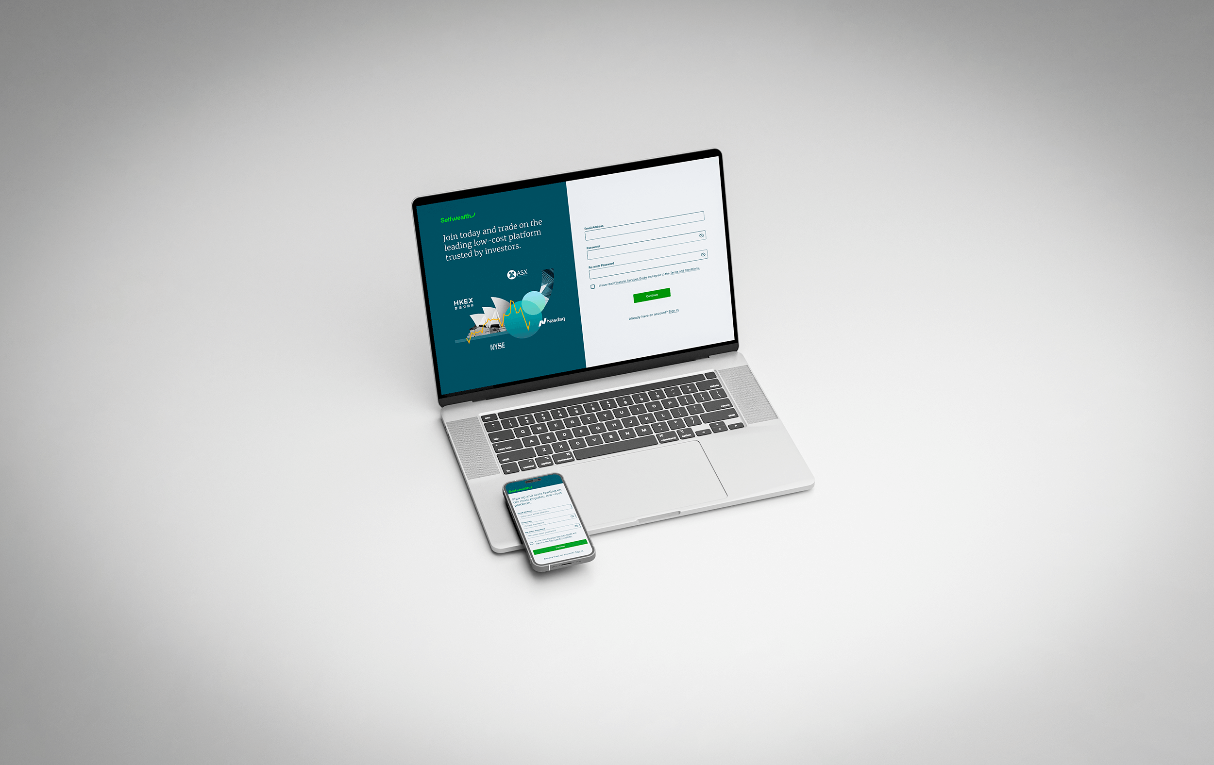
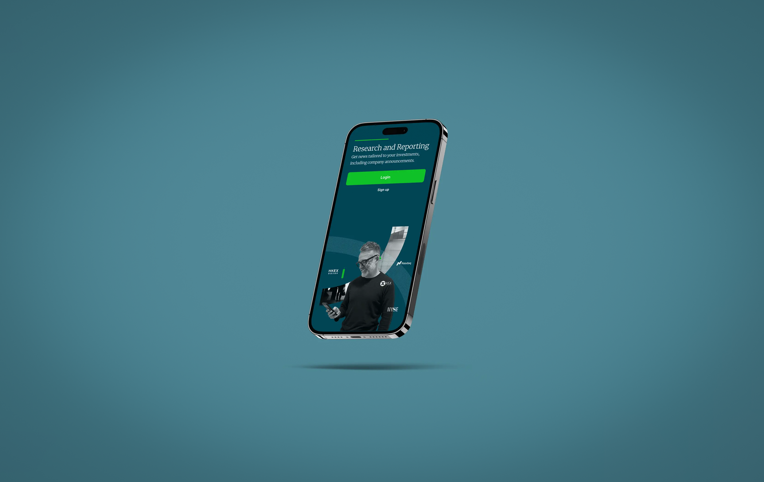
The final flow was developed as a prototype, enabling real-time testing. The design leveraged elements from the existing brand design company library, which we could build upon further. It successfully passed all accessibility checks and established consistent behavior across previously fragmented elements.
The new flow was structured to divide the form into subject-specific sections, limiting the number of questions visible on the screen at any given time. Paired with the reduced overall question set, this approach eased cognitive load and gave the perception that completing the form was quicker than it actually was.
Concept Prototype