Racing.com
The design behind the award-winning Racing.com app
Client
Racing.com
Role
Art Director & Lead UX/UI
Project Management, Wireframing, UI Design
Category
Background
Racing.com is Australia's premier thoroughbred media platform, reaching 95% of Australians through its free-to-air channel. In addition to its broadcasts, it provides digital content through the Racing.com website, mobile site, & app. Thoroughbred racing enthusiasts engage with a wide range of content, including form analysis, news, videos, & profiles.
The Problem
The Racing.com app is currently limited to iOS users, which restricts its potential reach to a broader audience. The app's response time is slow, negatively impacting the user experience, and it lacks consideration for overall usability. The content being produced has surpassed the app's current structure, resulting in a confusing menu system that misguides users to incorrect sections. Additionally, several areas of the app lead to dead ends, contributing to an increase in user drop-off rates.
My Role
As the Art Director for Racing.com, I led the project from concept to completion, working closely with designers, developers, and product owners. My role involved briefing stakeholders, managing workloads, designing wireframes and user flows for testing, conducting user testing, analysing feedback, and presenting the proposed approach to the executive team. After receiving approval, I spearheaded the UI design, establishing the overall style and collaborating directly with developers to bring the vision to life.
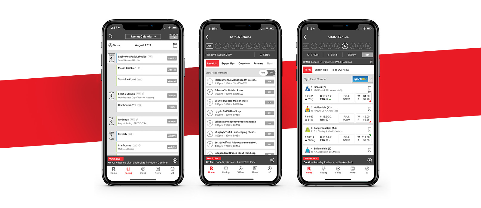
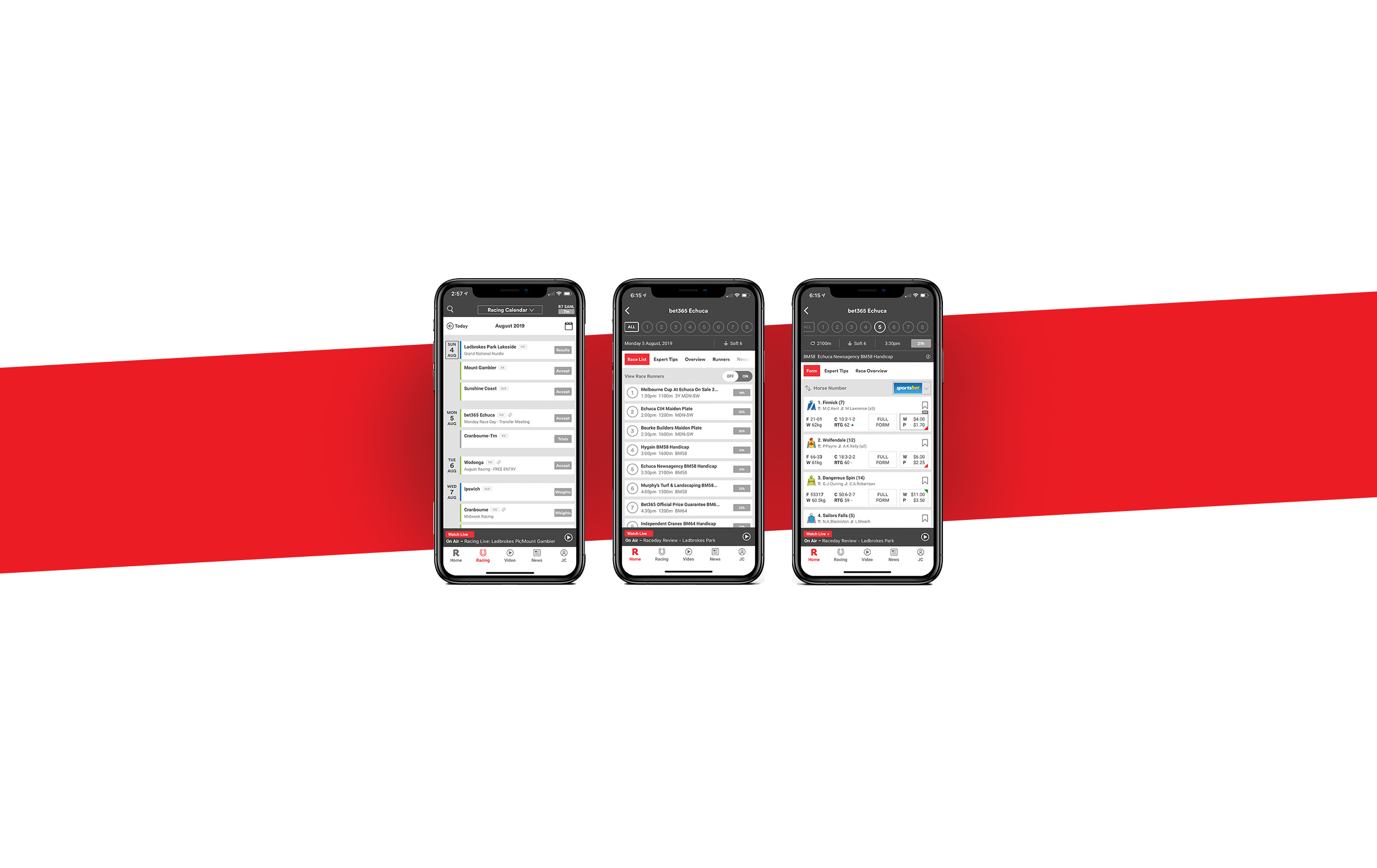
One of the main challenges identified in the previous app version was its navigation system. UX testing revealed that a significant percentage of users faced difficulties navigating forms and accessing the latest news, which made the app feel restrictive and one-dimensional.
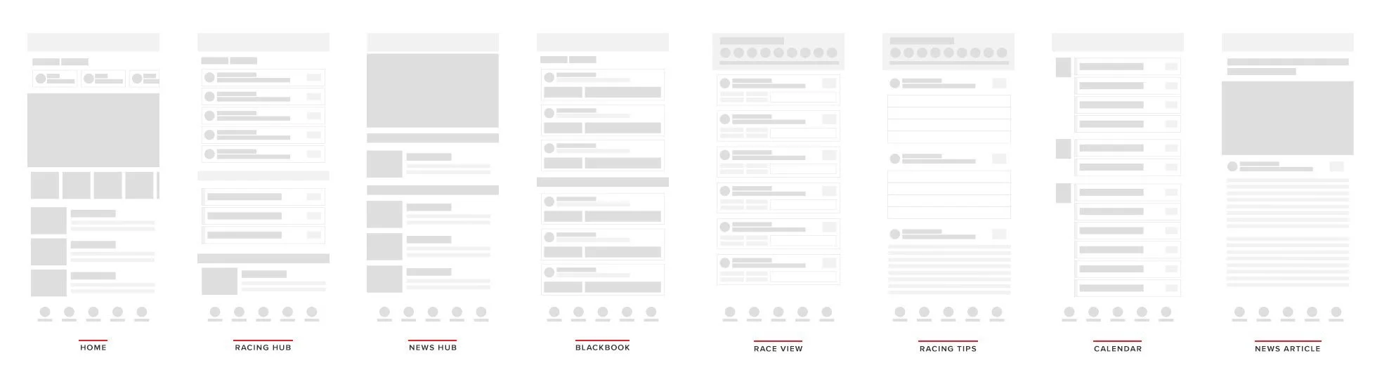
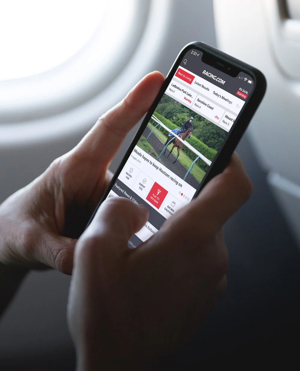
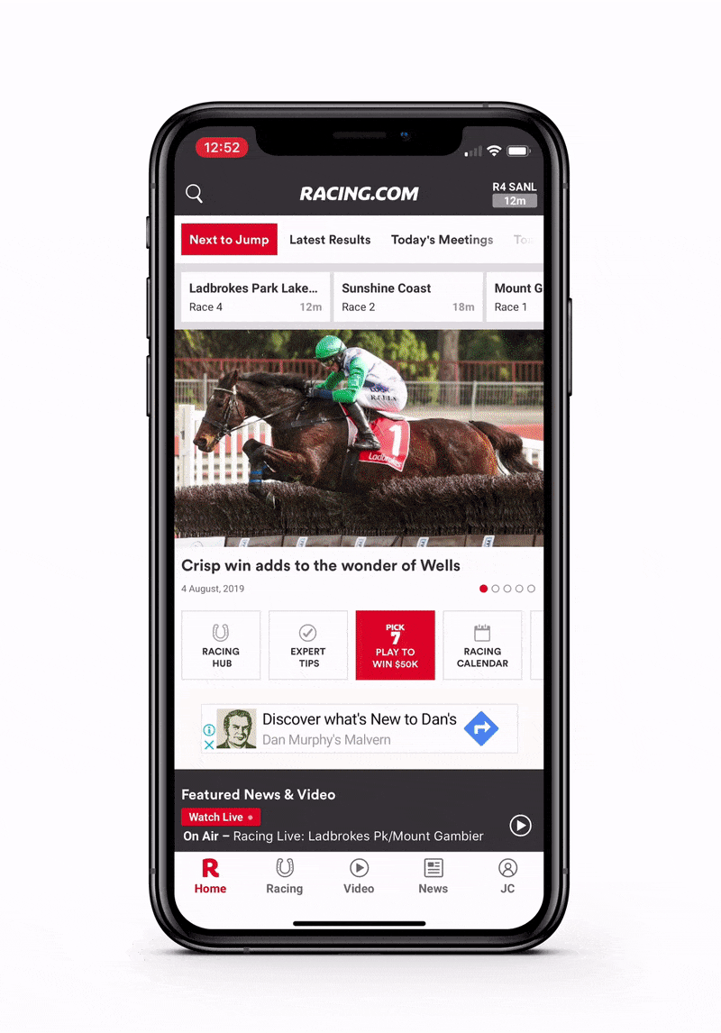
To address this, we introduced a new pillar-based architecture in the updated app, placing a strong emphasis on live racing. This streamlined structure ensures that all key content is just one or two taps away, a significant improvement from the multiple steps required in the earlier version.
The results of the beta navigation tests were highly positive—most users reported that navigating to their desired content was much easier and more intuitive.
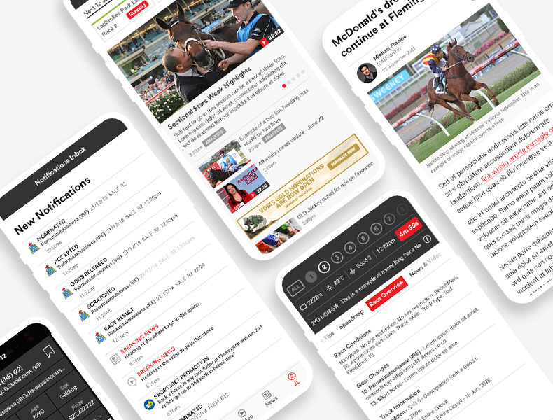
App Navigation Improvements

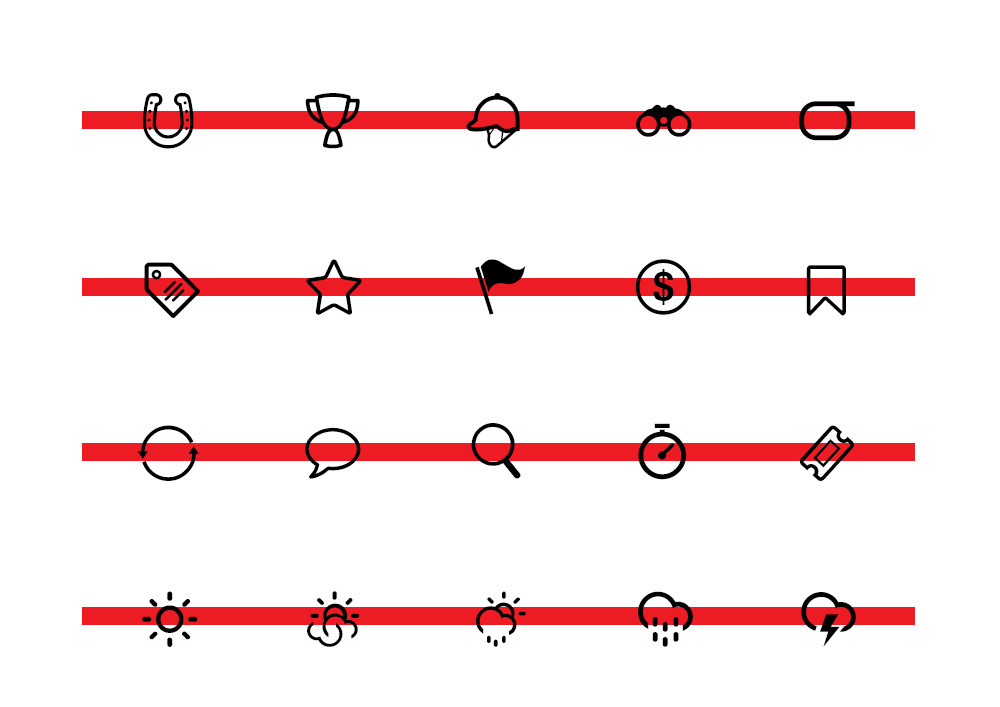
An icon font set was created to address pixelation issues across various screen sizes on iOS and Android platforms. This ensured a consistent user experience across all devices, including iPads. The font includes over 70 icons, all designed in Adobe Illustrator.
App Iconography
Since the release, Racing.com’s total year-over-year session and user growth figures for web and app are sitting at a remarkable 25%.
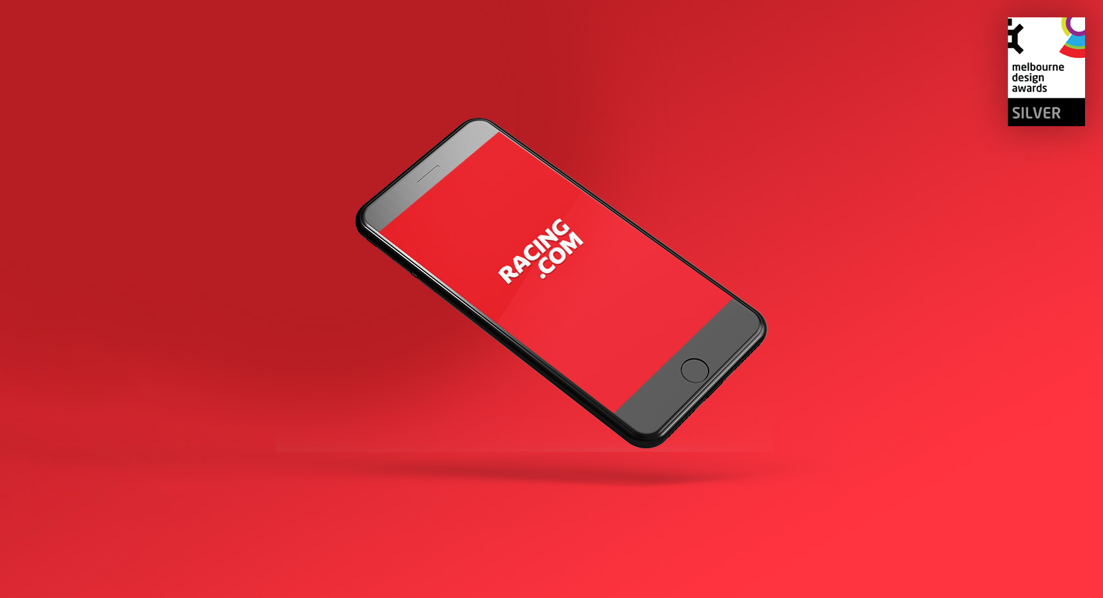
Racing.com’s app peaked as the #2 trending app in Australia and currently has a 4.6 rating on the Apple Store. It also was awarded silver in the Melbourne Design Awards.